Epidemiological summary plots
PUBLICATION: ACP – Decoupling of urban CO2 and air pollutant emission reductions during the European SARS-CoV-2 lockdown
Google resources: https://google.org/crisisresponse/covid19-map
What is the current situation in important European economies, Austria and the US?
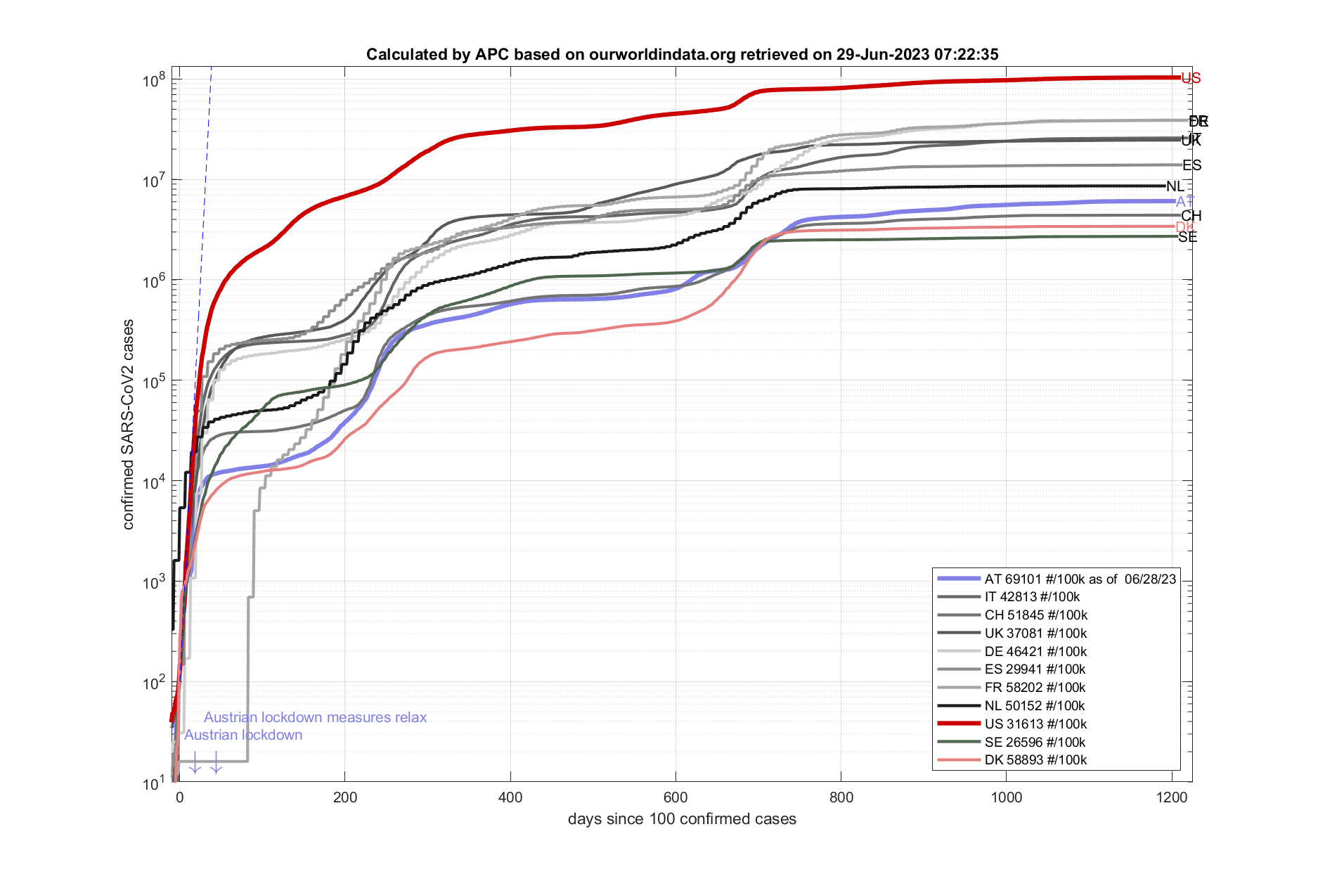
Fig. 1: Current SARS-CoV2 cases in comparison. Calculations are daily updated and visualized by the APC group. (data source: www.ecdc.europa.eu)
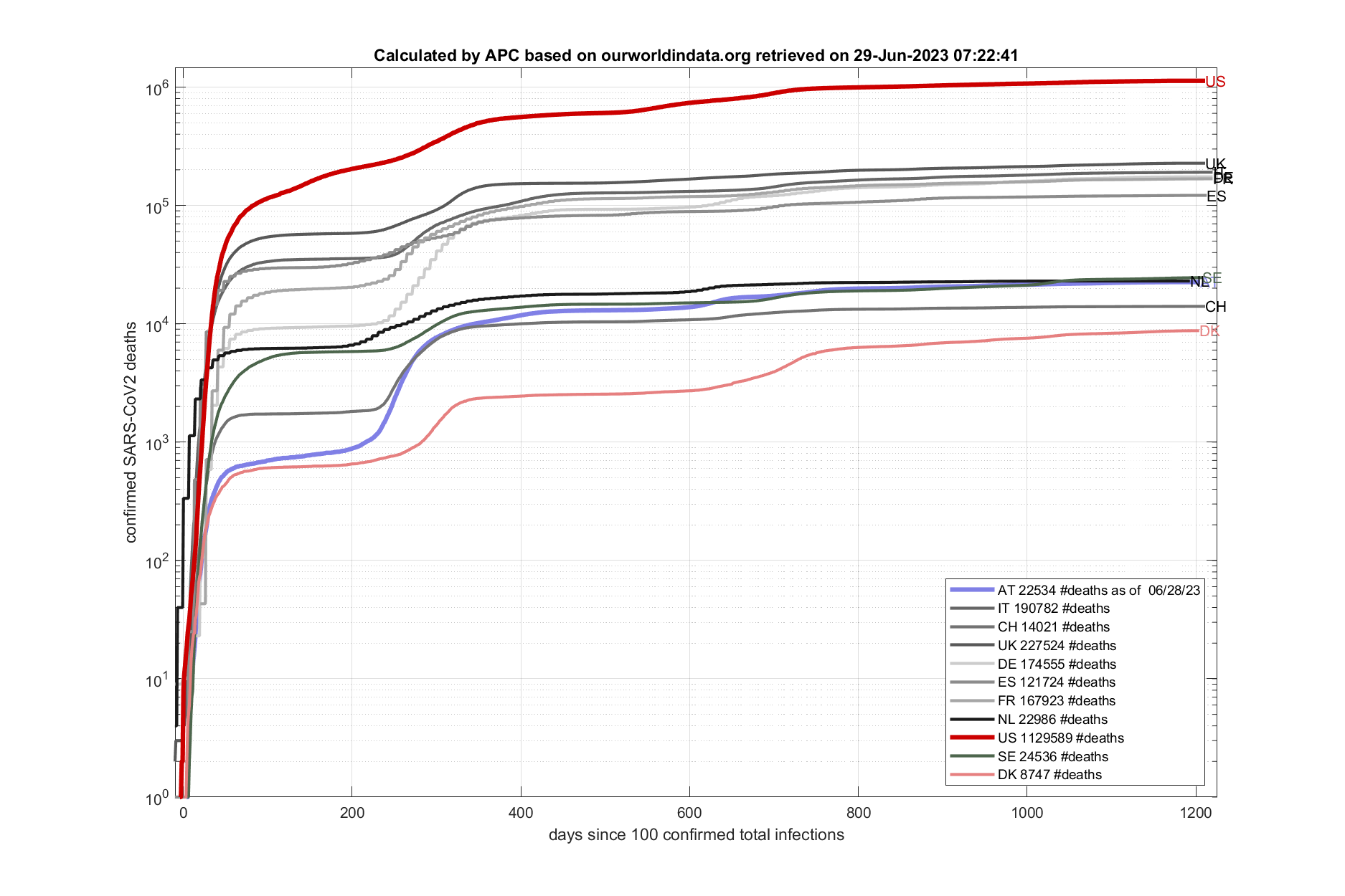
Fig. 2: Current SARS-CoV2 deaths. Calculations are daily updated and visualized by the APC group. (data source: www.ecdc.europa.eu)
The figure below shows infection rates and incidence rates for Austria. Incidence rates are being used to impose travel restrictions. Germany defined a threshold of 50 #/100k (dashed line). A European attempt to use similar concepts has been implemented in ‚Corona traffic light‘ tools (links below). Yet, different testing strategies (see Fig. 8) among different European countries are posing a challenge for this measure. A European wide strategy for defining thresholds for travel restrictions has so far failed.
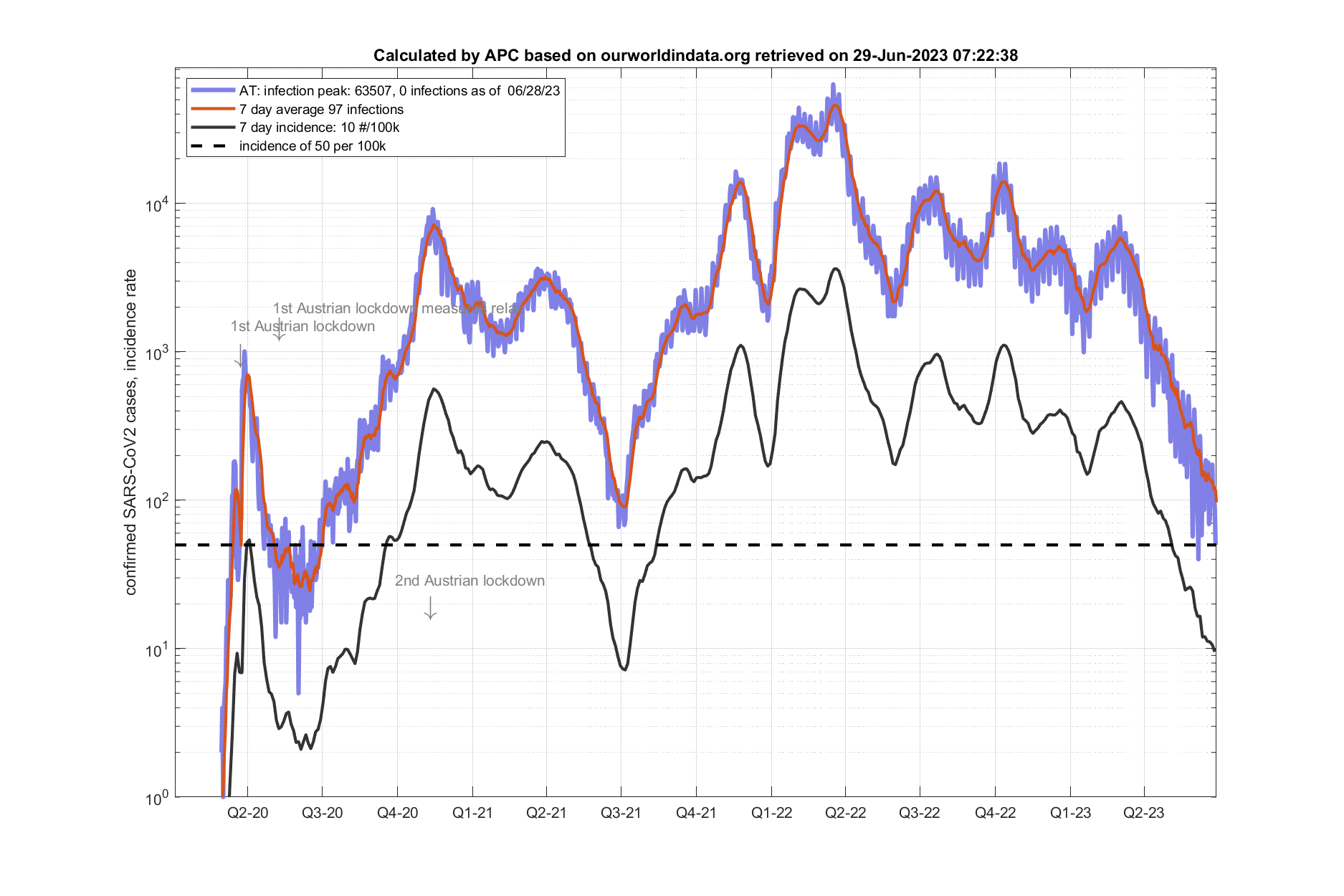
Fig. 3: SARS-CoV2 cases and incidence rates in Austria (data source: www.ecdc.europa.eu)

Fig. 4: SARS-CoV2 active cases (estimated by APC), ICU and hospitalization (data source: www.ourworld.org)
The figure below shows the current doubling time (Verdopplungszeit) of confirmed SARS-CoV2 cases in comparison. It is calculated from Fig 1. and averaged over the past 4 days. How to interpret this figure: let’s say (as an example) that the average duration of a sickness is 10 days – when the doubling time reaches 10 days as many people should recover as get infected and the reproductive rate should drop below 1, necessary to control the outbreak.
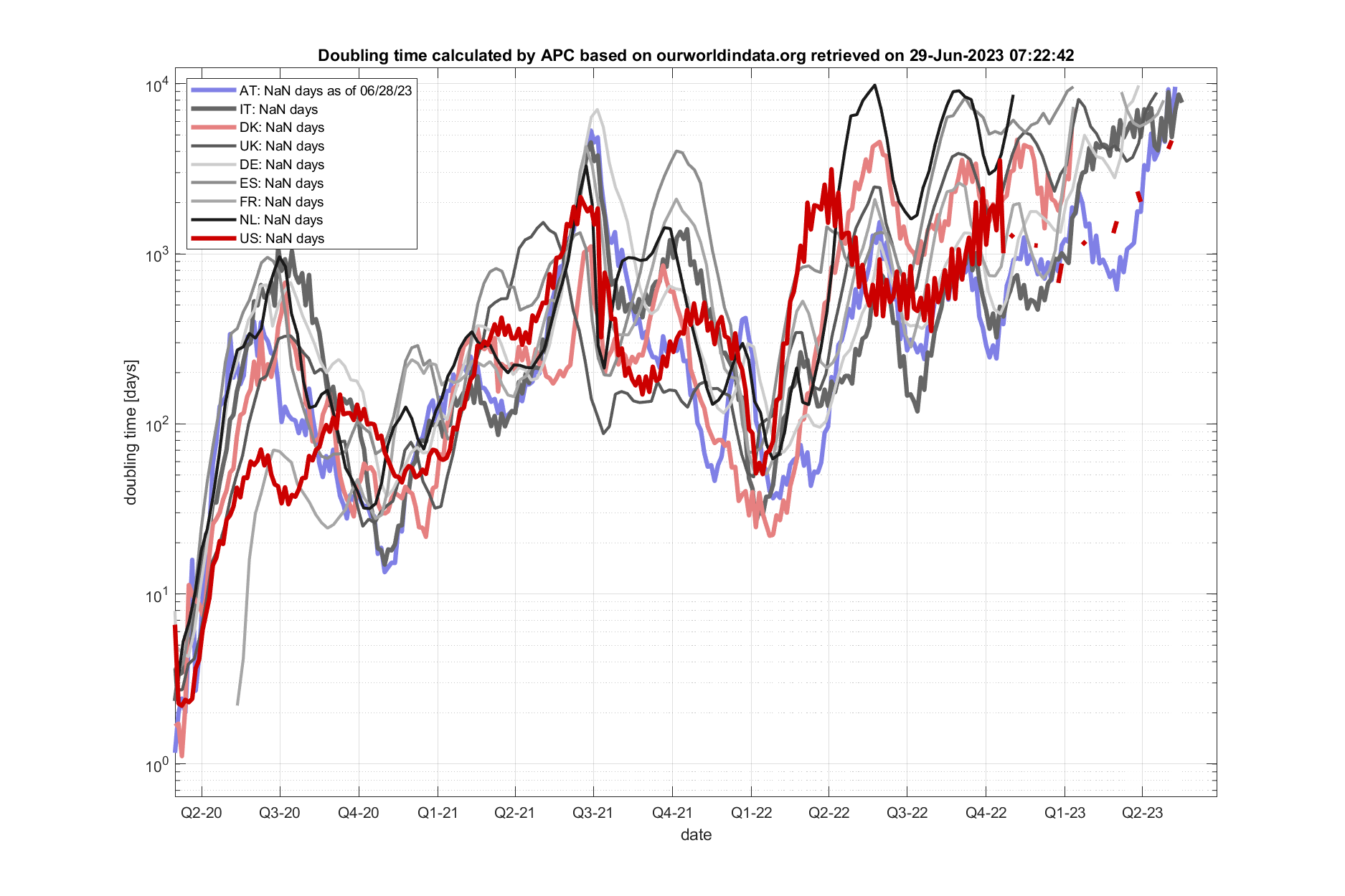
Fig. 5: Calculated doubling times. Calculations are daily updated and visualized by the APC group. (data source: www.ecdc.europa.eu)

Fig 6: Estimated effective reproduction rate Reff for Austria. Potential seasonal reductions calculated from HISTALP. Calculations are daily updated and visualized by the APC group. (data source: www.ages.at)
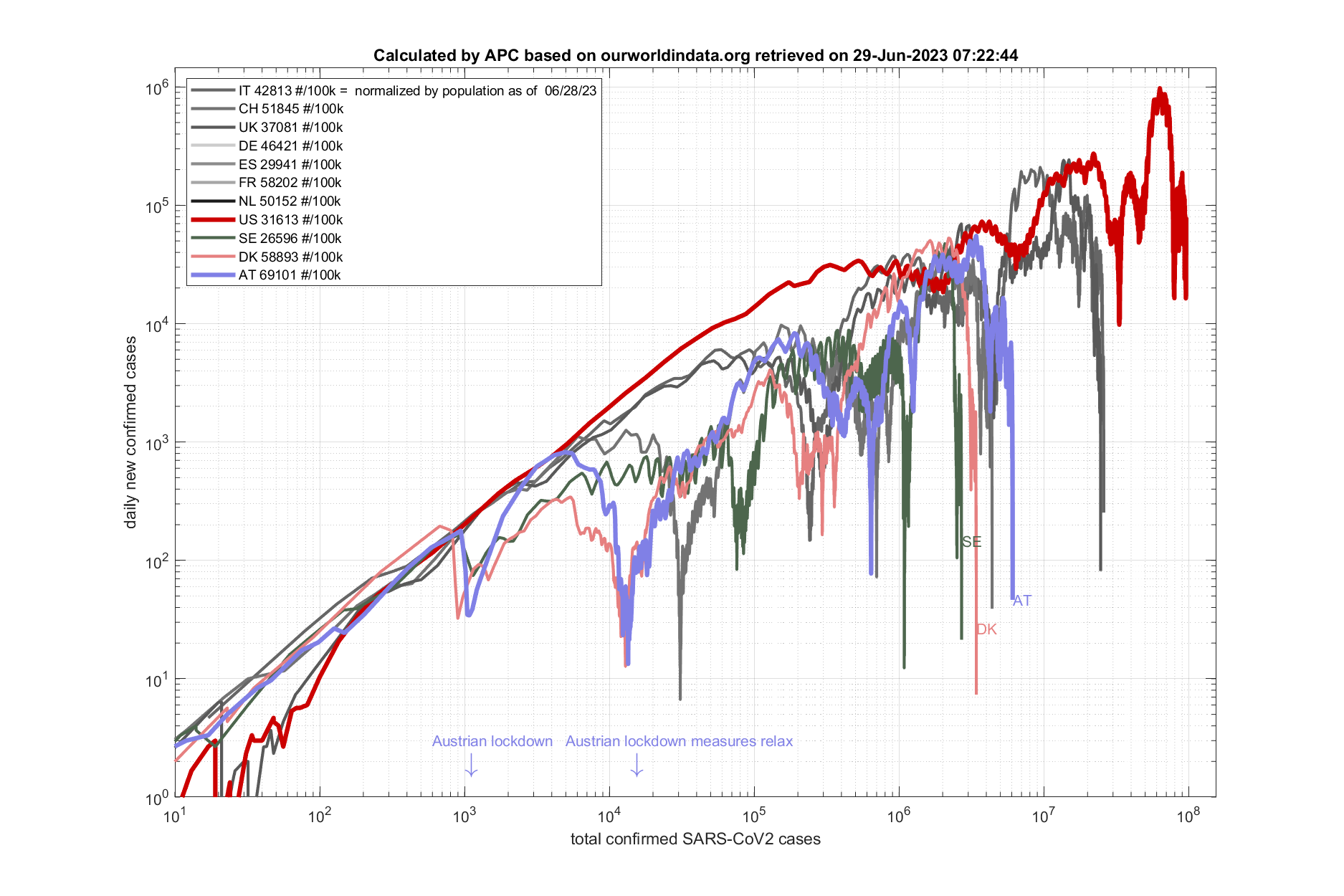
Fig 7: Daily new cases vs total cases. Calculations are daily updated and visualized by the APC group. (data source: www.ecdc.europa.eu)
Testing strategies among various European countries vary quite a bit. This is evident by comparing the ratio of deceased over positively tested individuals. For example for Austria and Germany, which have quite comparable public health systems, the ratio has been about 2-3 for most of the pandemic in 2020. Austria finds more positive cases than Germany per deceased. Incoherent national testing strategies has been a major issue for European efforts to compare the severity of the pandemic between different countries.
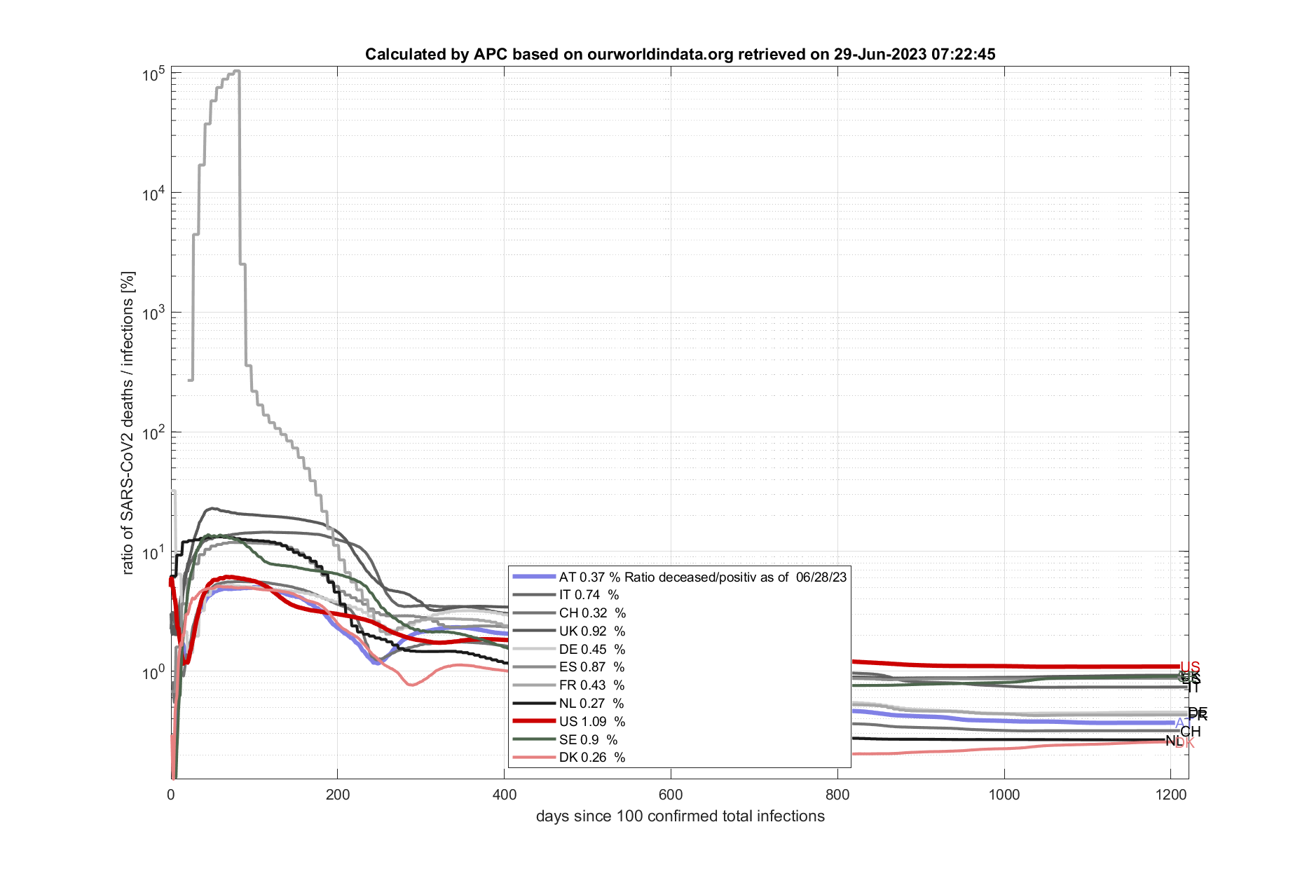
Fig 8: Ratio of reported deaths to reported infections among different countries. Calculations are daily updated and visualized by the APC group. (data source: www.ecdc.europa.eu)
Testing has increased 10 fold in most European countries in 2020. Comparing the first and second wave is therefore tricky. The positivity rate (=positive cases / total tested cases) is a measure that makes individual SARS-CoV2 waves more comparable.

Fig 9: Positivity rate and hospitalization rates in Austria. (data source: www.ourworldindata.org)
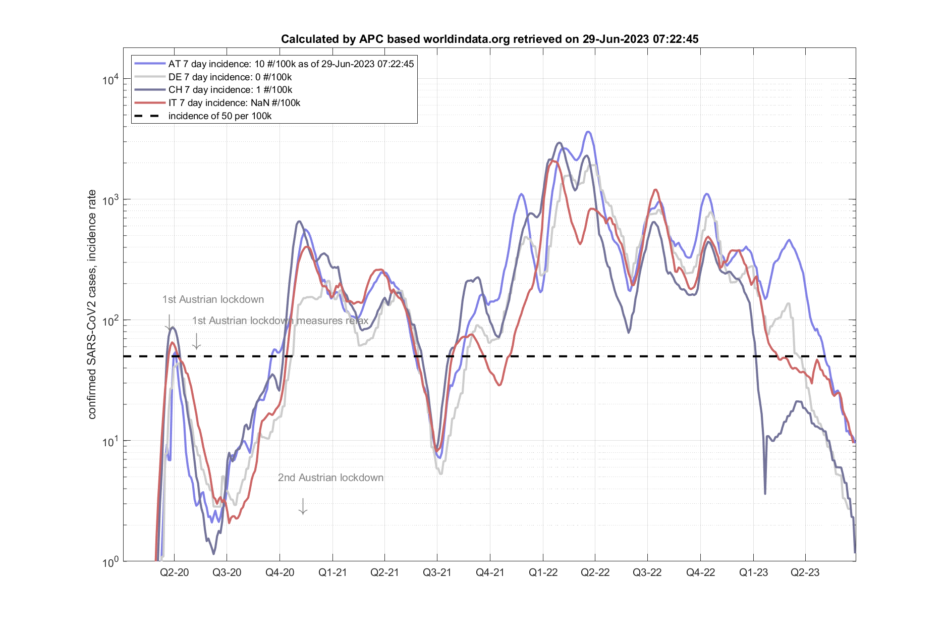
Fig. 10: Comparison of 7 day incidence rate (data source: www.ourworldindata.org)
other Useful links:
World: https://www.worldometers.info/coronavirus/#countries
John Hopkins Univ.: COVID and DATA
Mortality data: https://www.euromomo.eu/graphs-and-maps#z-scores-by-country
Positivity rate: https://ourworldindata.org/coronavirus-testing
Corona Traffic LIGHT worldwide: https://vis.csh.ac.at/corona-traffic-light/world/
Situation in Austria: https://orf.at/corona/daten/oesterreich
Austria: AGES Dashboard COVID19
CoronaAmpel CSH: https://vis.csh.ac.at/corona-ampel/#